Friday, 30 March 2012

Customer satisfaction 101

Contracts for sign jobs are a necessity of the business. They give a hard copy of what is expected of you as a service provider but also protect you from unnecessary conflict. Any time a customer contacts me for a sign job or a vinyl graphic, I document the conversation as to what they want and need. It makes things go alot smoother in the long run and avoids disappointment. Over time I've learned to ask the right questions to get the full spectrum of what the customer wants so I can get started on the job without having to call them back other than to give them progress reports. 
Questions:

  • Which direction does the sign face - This is actually a very important question because it may change the materials that you recommend based on sun exposure. 
  • Distance from road and foot traffic as well as the location of the sign height  - This will determine the amount of contrast the letters need on the background and determine the correct height of the graphics to be legible.
  • Is the sign being backlit - Determining the substrate being used to create the sign as well as overall design.
  • Dimensions of the sign - This is the most basic of questions because you need to find out your overall square footage of the sign to calculate material costs.
  • Is the customer installing the sign - If yes problem solved. If no then arrangements will need to be made to either install the sign yourself or have a sign installation company do it for you.
  • What is the sign being put on - Is it going onto a light box, a post, over top of another sign? If there is no sign present and it is a brand new install, you will need to have the customer arrange to have the utility companies come out and mark where the utilities may be running under ground. The last thing you need is to be driving a spike through a gas line or electrical connection.
  • Life of the sign - What is the expected life of the sign the customer requires. This is important as it can save you frustration and grief in the long term. If a customer wants a wood carved sign to last them 25 years, maintenance free. I try to steer them away from wood and suggest High Density Urethane as a viable alternative. Wood will need to be touched up and repaired every 5 years or so to fix blemishes, pealing, cracking, and warping. If a customer wants a vinyl sign then it is merely suggesting higher grade vinyls that will survive longer. Know your product specifications.
There are so many questions that need to be answered to make your customers happy and content but if you want referral work then you need to make them happy. People in general will have lengthy conversations about how unhappy they are with poor service and product but rarely give any thought to saying in a conversation how happy they are with what you have provided for them because it is what is expected from you as a service provider.


Stay creative my friends

Saturday, 10 March 2012

Letter Sizing

Letter sizing is a key component to the quality of any well designed sign. There are standard rules of thumb such as 1 inch for every 10 feet. That rule of thumb only works when lighting conditions are nominal, standard fonts such as Helvetica or Arial are used, and the white space around the letters is large enough to allow for proper contrast. If the sign is to be read at a speed of 50 km/h or 100 km/h makes a large difference as well. Billboard type signs require a driver to take their eyes off of the road therefore decreasing reaction time. I know for me personally, if I have to strain to read a sign, I ignore it. 
    
MAXIMUM
READABLE
DISTANCE
READABLE 
DISTANCE
 
FOR MAXIMUM
IMPACT
LETTER
HEIGHT
100'
30'
3"
150'
40'
4"
200'
60'
6"
350'
80'
8"
400'
90'
9"
450'
100'
10"
525'
120'
12"
630'
150'
15"
750'
180'
18"
1000'
240'
24"
1250'
300'
30"
1500'
360'
36"
1750'
420'
42"
2000'
480'
48"
2250'
540'
54"
2500'
600'
60"


Other factors that come into play are the colour contrasts that make a sign work.


The bottom 4 colour contrasts on the chart have a tendency to colour bleed together and are hard on the eyes to distinguish so a bordering contrast colour such as white or yellow around the letters is commonly used.


Well, I hope this has been useful to you and you now have a quick reference guide to help in designing a sign which allows for maximum impact. Stay creative my friends.

Thursday, 23 February 2012

Sign Design Colour Choices

One of the things to take into consideration when you're designing a vinyl sign is colour choices. Although vinyl comes in an almost limitless array of colours, that exact match may not always be attainable. To solve this problem, one of the methods I use is I took my colour samples provided by my vinyl supplier and scanned them into my computer both flats and glosses and saved them into a custom colour pallet. Using these as your fill colours can make a world of difference when creating your design because you will have a relatively accurate representation for your customer. Verify with your supplier as well that they have these colours in stock as well. The last thing you want is to be on a very limited timeline to only find out that although the sample is available, it is a special order item or can only be purchased in a full roll not a partial. Having all of this info sitting on the table will also save you alot of aggravation as well as an upset customer because of an unknown factor that could have been avoided. If you do have to special order some vinyl, verify the time frame from your supplier. If they say 4 to 5 business days for delivery, allow for 5 to 10. Things happen and again, your customer will be alot happier to hear from you early stating that their sign is complete early than getting a call saying there has been a delay.
As always, stay creative my friends.

Wednesday, 22 February 2012

Sign Shapes

I've had a lot of people ask me about how I come up with some of the elaborate sign shapes and borders that we design. To be honest, my favourite designs kind of created themselves. I complete the overall layout of the sign and create a basic contour around it. This is especially useful in designing older heritage style signs. Many of the small towns where I live are very strict when it comes to the signs that are allowed and the protocols that designers must adhere to. Using this method I've never had a design rejection from the various boards I've submitted to.

This is my most recent design.


All sign makers and designers should have an array of basic templates in their arsenal as well, but I rarely use them any more. For the most part I find they restrict the creative process and limit my designs. Stay creative my friends.

Sunday, 19 February 2012

Selling yourself short?

I came across this picture the other day and it got me to thinking. How many of us who have our own businesses in a creative field have fallen into the trap of giving away free work to get ourselves noticed?


I know that I personally did it on a regular basis when I started out. I was under the impression that if I made signs at an extremely low price to undercut everyone else, I would gain notoriety and exposure. The exposure is good but at what price. I was suddenly seen as less than professional because I didn't value my work or my abilities. Unfortunately it took a long time to get myself out of that public perception. Don't get me wrong, I still do charity work on a regular basis. That is a totally different ball of wax. I charge what my work is worth now. I provide a level of quality and customer service that is second to none so my customers are more than willing to pay my prices. I gain exposure because of the quality of my work and my love of what I do. So my friends, in closing : If you feel your work is worth less than everyone else' then by all means charge less. If you're afraid that you won't make sales because your price may be too high, by all means lower your rates. But please, don't undervalue yourself. The moment you do, you set yourself up for failure. Hope this post inspires you and as always, stay creative my friends.

Wednesday, 25 January 2012

Different methods and techniques

This decal has been in discussion with my customer since October. He was looking to get it for his stepfather as a present. He needed 30 of them produced. I gave him my pricing back then and we stayed communicating about it with some minor changes here and there, Last week he finally gave me the go ahead to pull the trigger on it and do them up for him. I set to it and  got all 30 cut on the vinyl cutter. One of the things I've learned when cutting very small letters is to pull the centres out of the letters before weeding the exteriors. The letters will move around on the backer a lot less that way.


 This is a quick glance at what vinyl looks like when it has been cut before weeding the excess waste material.


These letters were less than a third of an inch high. I started removing the excess from the bottom as it was easier this time than going from side to side.


I pull the excess up to about this point on each line and make sure that all of the letters are not coming up with it. Carefully pushing any portions of letters back down onto the backer.


The dot for the i and the apostrophe can be the bane of many a sign shops existence. They have a tendency to  come off on the cutter or lift up with the weeding.


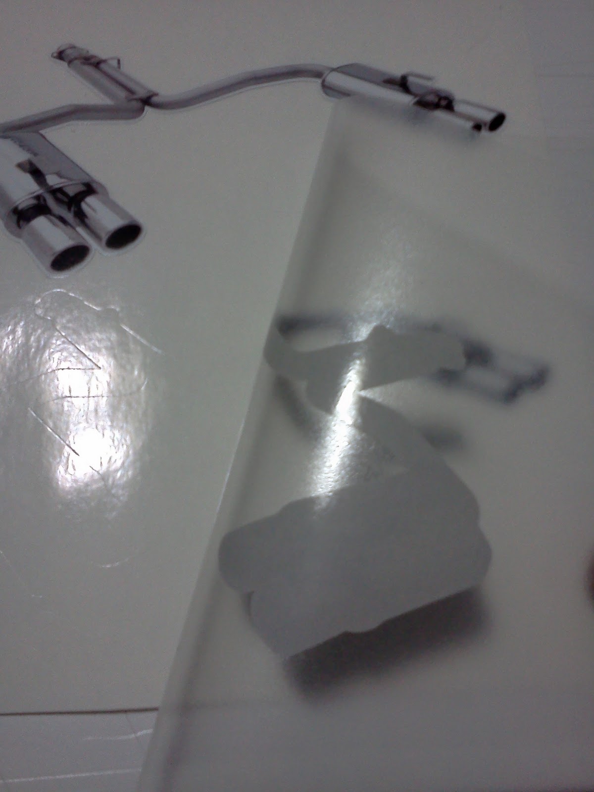
On to the printed and contour cut portion. I put the transfer tape down onto the exhaust system sticker, and squeegee'd it smooth.


And removed it from the backer.


Carefully hovering the exhaust sticker over top of the lettering portion of the graphic, I got it lined up. I removed as much of the static as possible so the vinyl graphic wouldn't inadvertently lift up onto the transfer tape.


When I was happy with the location, I lowered it down into place.


Pressing everything into place with the squeegee to insure the entire graphic lifts smoothly in one try.


Peeling up the back corner to remove the weed border. Because I didn't use registration marks, this was the easiest way to make sure I stayed within the boundary.


Border gone and this is what my customer will receive.


I made up an accompanying video to show how to install this type of decal to achieve the best possible results.


Thank you my friends and always stay creative.

Monday, 16 January 2012

Don't quit before the miracle

It's not very often in life when you get the opportunity to meet a celebrity or one of your heroes growing up. On Thursday night of last week I had the pleasure and privilege of meeting Theo Fleury. He's been doing speaking engagements titled "Don't quit before the miracle" and goes into great detail about the fight he waged against drug and alcohol addiction. I messaged Theo on Wednesday when I noticed that he would be down in Toronto at Forest Hill Collegiate doing one of these engagements and thought it would be the perfect time to get him to autograph the guitar I airbrushed for the charity I'm 1in5. He said he would love to do it and would meet with me afterward to sign it. I drove down to the city guitar in hand hoping that I wouldn't be let down not having met Theo personally. I sat through Theo's very moving tale of courage and hope and during the questionaire saw his brother Ted.. I approached Ted and mentioned to him that I was supposed to meet up with Theo after and explained that it had all been arranged previously. The moment of truth. To my astonishment Ted had heard of me and said to follow him up to the stage while Theo was signing autographs. I saw the lineup for signatures and figured oh great, this isn't going to happen. Ted looked at me and said, follow me. He took me right up onto the stage with Theo. I was in awe. Ted leaned over too Theo, tapped him on the shoulder and said that I was there and Theo reached over and shook my hand and said it was a pleasure to meet me. He looked at the guitar and signed it right then and there. I was dumbfounded. I asked if I could get a picture with him and he said when he was done to go backstage with him for the photo. Again, dumbfounded and in awe. I waited for the photo opportunity and the moment came. I had my Mom with me as she is my biggest supporter, and we both went backstage. Theo signed a hockey card for her and I handed off mom the camera and she snapped a couple shots. I took the opportunity to thank Theo so much for everything and with a firm handshake it was done. I saw Ted and thanked him as well. What an awesome individual.


Thank you Theo.